Why Your Artwork Looks Different on Screen and in Print
By Cassie Stone, Founder of REvisART ·
Key takeaways
- A screen emits light and a print reflects it, so your display brightness, settings, and room lighting all affect the comparison.
- Every printer, ink set, and paper can reproduce a limited range of colors. Some colors a screen shows fall outside that range.
- Paper white, coating, texture, and finish all change how the image reads. No single paper is right for every painting.
- How vivid a print looks today and how long it lasts are separate questions. A bright print is not automatically archival.
- Use a physical proof in consistent light to make specific, area-by-area decisions, and evaluate again when the paper or production method changes.
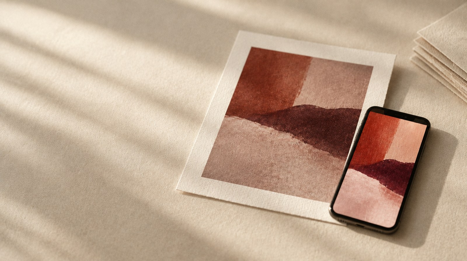
You open the file on your phone, hold the print beside it, and something feels different. Maybe the blue has less punch. Maybe the shadows seem heavier. It is easy to decide the print is wrong before you have looked at how you are comparing it.
As a gallery owner and the founder of REvisART, I want artists to feel comfortable selling their reproductions. That confidence comes from evaluating the physical print and understanding the choices behind it. A screen preview is useful, but it cannot answer every question about the object your buyer will receive.
Your screen is part of the comparison
A screen produces its own light. A print reflects the light around it. That alone changes the experience of the same image. Screen brightness, display settings, and the lighting in your room can make the comparison even harder.
If you edited an image on a very bright display, you may have made decisions that look different on paper. Warm display settings can also affect how you judge the image. Before you change the file again, look at the conditions you used to edit and review it.
There are color limits, too. A printer, its ink set, and a particular paper can reproduce a certain range of colors. Some colors your screen shows fall outside that range. A color-managed workflow helps translate the image for the printing setup; it does not give paper the ability to glow.
Paper contributes to the image
Paper is more than the thing holding the ink. Its base color, coating, texture, and finish affect how the image appears. The lightest areas can take on the character of the paper white. Texture can become noticeable in a delicate passage. Finish can change your impression of contrast and depth.
REvisART's core paper choices include smooth matte, textured watercolor, cotton rag, and satin or baryta. I want you to compare those choices with your artwork in mind. A natural-white cotton rag may suit one image beautifully, while another image benefits from a different surface. Texture that supports loose brushwork might compete with very fine details.
There is no single paper that wins for every painting. Choose the result that preserves what matters in this piece.
The ink and printing method matter too
Different printers and ink sets can reproduce different ranges of color. Dye, pigment, and UV-curable inks are different systems used for different purposes. A print made by one method is not a reliable promise of what another method will produce.
That matters when you move between a fine art paper reproduction and a décor product, or when you change printing providers. Ask about the intended production method and surface. You are evaluating a complete combination, rather than an ink label or printer brand on its own.
Longevity is a separate question from whether a print looks bright today. The ink, the surface, and the way a print is displayed and cared for all matter. A vivid result alone does not establish that it is archival.
Use a proof to make a specific decision
Look at your proof in consistent light and describe what you see. Can you still distinguish the shadows? Do the important colors feel right? Are the lighter passages doing what they need to do? If you have the original available, compare it under the same lighting conditions while remembering that paint and print are different materials.
When something feels off, identify the area before making a global adjustment. "The shadow beside the bird has lost detail" gives you a more useful starting point than "Make it brighter." Keep your original file and make any intentional edits in a separate version.
A proof on one paper evaluates that result. If you change the surface or production method, ask about evaluating the new combination. REvisART's digital preview helps with scale and placement; it is not an exact color promise. Minor color variations can occur because screens, lighting, substrates, finishes, and production processes differ.
You do not need to order a full run to begin learning what your artwork needs. Start with a physical proof, ask specific questions, and choose a print you feel comfortable putting your name on.
Explore proofing through the REvisART Print Studio promotions page
Compare archival paper options
Frequently Asked Questions
Why does my art print look darker than it does on my screen?
A screen produces its own light, while a print reflects the light in the room. If the image was edited on a very bright display, shadows and midtones that looked open on screen can feel heavier on paper. Check your display brightness, display settings, and viewing light before editing the file again.
Why are some colors less vibrant in print than on screen?
Each printer, ink set, and paper can reproduce a certain range of colors, and some colors a screen displays fall outside that range. A color-managed workflow translates the image for the printing setup, but paper cannot glow the way a screen does.
Does paper choice change how an art print looks?
Yes. A paper's base color, coating, texture, and finish affect how the image appears. The lightest areas take on the character of the paper white, texture can show in delicate passages, and finish changes the impression of contrast and depth. REvisART's core papers include smooth matte, textured watercolor, cotton rag, and satin or baryta.
Does a vivid print mean it is archival?
No. Longevity depends on the ink, the surface, and how the print is displayed and cared for. A vivid result alone does not establish that a print is archival.
How should I evaluate a print proof?
View the proof in consistent light and describe what you see. Check whether shadows are still distinguishable, whether the important colors feel right, and whether lighter passages hold. When something feels off, identify the specific area before making a global adjustment, and keep your original file while making edits in a separate version.
Will my print look exactly like the digital preview?
Not exactly. REvisART's digital preview helps with scale and placement; it is not an exact color promise. Minor color variations can occur because screens, lighting, substrates, finishes, and production processes differ. A physical proof is the way to evaluate color on a specific paper and production method.
Cassie Stone is the founder of REvisART. She owns and operates a brick-and-mortar fine art gallery, where she works directly in collector sales, exhibition curation, and artist representation. REvisART gives working artists a view from the gallery side of the desk.